Wednesday, October 24, 2012

Type Categories

OLD STYLE 

this is old style because it has a diagonal stress. it has serifs, on lower case, and a decent thick to thin transition. 

Modern  

this modern type has a vertical stress, radical thick to thin transitions, and has thin serifs. 

Slab Serif 


there is very little transition from thin to thick, and a strong vertical stress.

Sans Serif  


this style is Sans serif because there is no serifs, no thick to thin translation, 

Script 

this is script, because of its stylish appearance. it almost appears to be hard written cursive. 

Decorative 

decorative is distinct and easily picked out. 

Type Relationship

Concordant 

this image is an example of concordant because it uses a very similar font if not the same and  image seems fairly formal and orderly. 

this book page is a good example of concordant because it is the same font. it is designed this way to ensure ease of reading. nothing in particular stands out. all the text is harmonious and simply arranged. 


Conflicting

the bold in facebook makes it stand out and makes it hard to concentrate on the rest. 

this image seems to be conflicting because of the last line "Costumes a must". this line is very similar to the rest but it seems to stick out because it looks a little bigger. 


Contrast 

the "Tricks and treats" is a different font from the rest of the invitation and really stands out
r
the "direct" is a different font size and a different style. it is used to draw attention to it and show it is the most important part of the ad. 

Sunday, October 21, 2012

Alignment examples


there is pretty good alignment with the adrees, Phone #s, email and website.


the alignment helps distinguish what equipment each paragraph is talking about.


all the fighters names are aligned at the top, the yellow banner area aligned the info about the event. and the alignment  of the logo info and sponsors.


large font aligns around the picture, and the subtext is aligned at the bottom.
 
the top font is aligned well and attracts attention. the story text in the middle is aligned in the middle and centers the ad well.
  
this is similar the the example we seen in the book. it has alignment in the middle but has bad alignment because the info on the sides.


the alignment of the sponsors is clustered and does not divide it to evenly or have good symmetry.

Sunday, October 14, 2012

Proximity


This groups basically all the subjects together. the red seams of the baseball catch my eye first but then my eye wonders to all the other sports equipment.

 
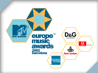
this ad is for the Europe music awards shown on MTV and its sponsors. this groups the sponsors in away that they so they are easy to see and with all the logos together the way they are makes the viewer quickly know these are the sponsors.


Movie poster are a good example of using proximity to show subject matter. the designer put the title next to the dragon in order to draw attention of the viewer to both.


this image groups the words together, much like a scrabble board to make the viewer focus on the letters.


they subject matter is the tagline of extra grip which is why the bottle was placed with in the glove. they are trying to market it as a sports drink so they used a baseball glove with the water.